Intraday charts feel predictable.
Candles form patterns.
Breakouts look obvious.
Reversals look clean — in hindsight.
So I decided to test two popular ideas using actual data and controlled simulations.
No opinions.
Just math.
Scenario 1 — The High Win-Rate Illusion
“My strategy wins 75% of the time.”
Sounds unbeatable.
But profitability is not about how often you win. It’s about expected value.
EV = (WinRate × AvgWin) + (LossRate × AvgLoss)Let’s test:
- Win rate = 75%
- Average win = +0.2%
- Average loss = −1%
EV = 0.75 \times 0.2% + 0.25 \times (-1%)

EV = 0.15% - 0.25% = -0.10%
You are right often. You are wrong in expectation.
Simulation Code (Run in Colab)
import numpy as np
import matplotlib.pyplot as plt

np.random.seed(42)

n_trades = 500
win_rate = 0.75
avg_win = 0.002
avg_loss = -0.01

results = []

for _ in range(n_trades):
    if np.random.rand() < win_rate:
        results.append(avg_win)
    else:
        results.append(avg_loss)

equity = np.cumprod([1 + r for r in results])

plt.figure(figsize=(10,5))
plt.plot(equity)
plt.title("75% Win Rate Strategy")
plt.xlabel("Trade Number")
plt.ylabel("Equity")
plt.show()

print("Final Return:", equity[-1] - 1)
print("Observed Win Rate:", sum(np.array(results) > 0) / n_trades)
Output:

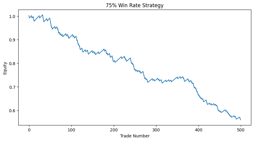
Final Return: -0.4397269441070888
Observed Win Rate: 0.738
What Happens?
The equity curve looks smooth.
Until it doesn’t.
Small gains. Rare but large losses. Negative long-term drift.
High win-rate does not mean positive expectancy.
Scenario 2 — Intraday Moving Average Crossover
“Simple MA(20/50) works on 5-minute charts.”
Let’s test it on real intraday data.
Download Intraday Data
import yfinance as yf
import pandas as pd
import matplotlib.pyplot as plt

data = yf.download("AAPL", period="60d", interval="5m")
data.dropna(inplace=True)
Strategy Implementation (With Cost)
data['MA20'] = data['Close'].rolling(20).mean()
data['MA50'] = data['Close'].rolling(50).mean()

data['Signal'] = 0
data.loc[data['MA20'] > data['MA50'], 'Signal'] = 1

data['Returns'] = data['Close'].pct_change()

cost = 0.0005  # 0.05% per trade

data['Trade'] = data['Signal'].diff().abs()

data['Strategy_Returns'] = (
    data['Returns'] * data['Signal'].shift(1)
    - data['Trade'] * cost
)

data['Cumulative'] = (1 + data['Strategy_Returns']).cumprod()
Plot Equity Curve
plt.figure(figsize=(10,5))
plt.plot(data['Cumulative'])
plt.title("Intraday MA(20/50) Strategy — 5 Minute")
plt.xlabel("Time")
plt.ylabel("Equity")
plt.show()

print("Total Return:", data['Cumulative'].iloc[-1] - 1)
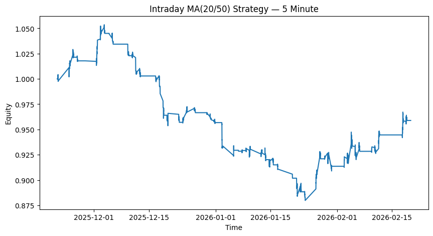
Total Return: -0.041099593860751904
Regime Test — Split the Data
mid = len(data) // 2

first_half = data.iloc[:mid]
second_half = data.iloc[mid:]

def evaluate(df):
    return (1 + df['Strategy_Returns']).cumprod().iloc[-1] - 1

print("First Half Return:", evaluate(first_half))
print("Second Half Return:", evaluate(second_half))
First Half Return: -0.07056558477419017
Second Half Return: 0.031703141642630994
Same Code. Different Outcome.
One half may show gains. The other may lose money.
The strategy didn’t change. The regime did.
What Actually Happened?
Intraday price is dominated by:
- Noise
- Microstructure
- Transaction costs
- Rapid regime shifts
Observed performance is:
[ Observed = TrueEdge + Noise + RegimeEffect - Cost ]
When the edge is small, cost and noise dominate.
Final Thoughts
None of this proves intraday trading is impossible.
It only shows:
- High win-rate can still lose money.
- Simple intraday rules decay quickly.
- Regime shifts matter.
- Cost destroys small edges.
Intraday is not magic.
It’s math.
Reproducibility
All code used to generate the charts above is included.
Run it. Modify parameters. Break it. Test it.
That’s the point.